01
A mark from scratch
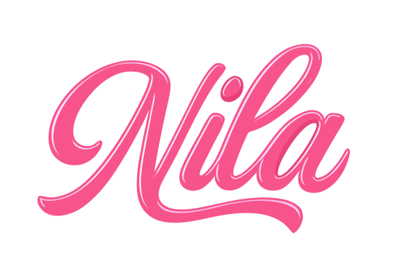
For Nila we designed the logo and core brand mark from scratch — the foundational identity the brand would be recognised by and build everything else on.
A logo is a small thing that carries a lot of weight: it is the first signal of who a brand is, and it has to hold up everywhere it appears. The work was to give Nila a mark that is distinctive, considered and unmistakably its own.
We took the identity from a blank page through to a resolved logo, refined until it had a clear point of view and the durability to carry the brand consistently across every touchpoint.
A single, well-made mark — the foundation a brand is recognised by and everything else is built on.
02
Distinct and durable
The challenge with any logo is to be both distinctive and durable — instantly recognisable, yet simple and flexible enough to work at every size and in every context the brand will need.
Starting from a blank page, with no existing identity to anchor to, the mark had to establish the brand’s character on its own and set the direction everything else would follow.
The brief was to design exactly that: a logo with a clear point of view, resolved well enough to be the confident foundation of the brand.
03
Considered, not off-shelf
We approached the mark as a foundation rather than a decoration. Beginning from a blank page, we explored directions that could express the brand’s character, then refined toward one that was distinctive and simple enough to last.
The logo was resolved for real use — legible and balanced at every size and in every context — so it holds up consistently wherever the brand applies it.
A few principles kept the work honest:
- A logo designed from a blank page
- A mark with a clear, distinctive point of view
- Simplicity and flexibility for durability
- Legibility and balance at every size
- Consistency across every context and touchpoint
- A foundation the brand can build on
04
A confident foundation
The result is a resolved logo and brand mark that gives Nila a confident, recognisable foundation. It establishes the brand’s character in a single mark and gives everything that follows a consistent anchor.
Because it was designed for real use rather than as a one-off graphic, it carries cleanly wherever the brand needs it — the dependable centre of the identity.
What we delivered:
- A distinctive logo designed from scratch
- A mark with a clear point of view
- A resolved, real-use identity
- Consistency across sizes and contexts
- A recognisable anchor for the brand
- A foundation to build the wider identity on
05
What the mark changed
Nila now has a distinctive identity where there was a blank page. The logo gives the brand a recognisable face and a clear character to lead with.
As a foundation, it is an asset the brand can grow from:
- A distinctive brand mark where there was none
- A clear character established in a single logo
- A recognisable face for the brand
- A consistent anchor across touchpoints
- A resolved, real-use identity
- A foundation ready for a wider system
06
The foundation stone
Nila is a reminder that the logo is the foundation stone of a brand — the mark it is recognised by and everything else is built on.
Designed from a blank page and resolved for real use, the identity gives the brand a distinctive, durable centre.
What Nila now holds is a confident foundation — a logo with a clear point of view, ready to anchor the brand as it grows.


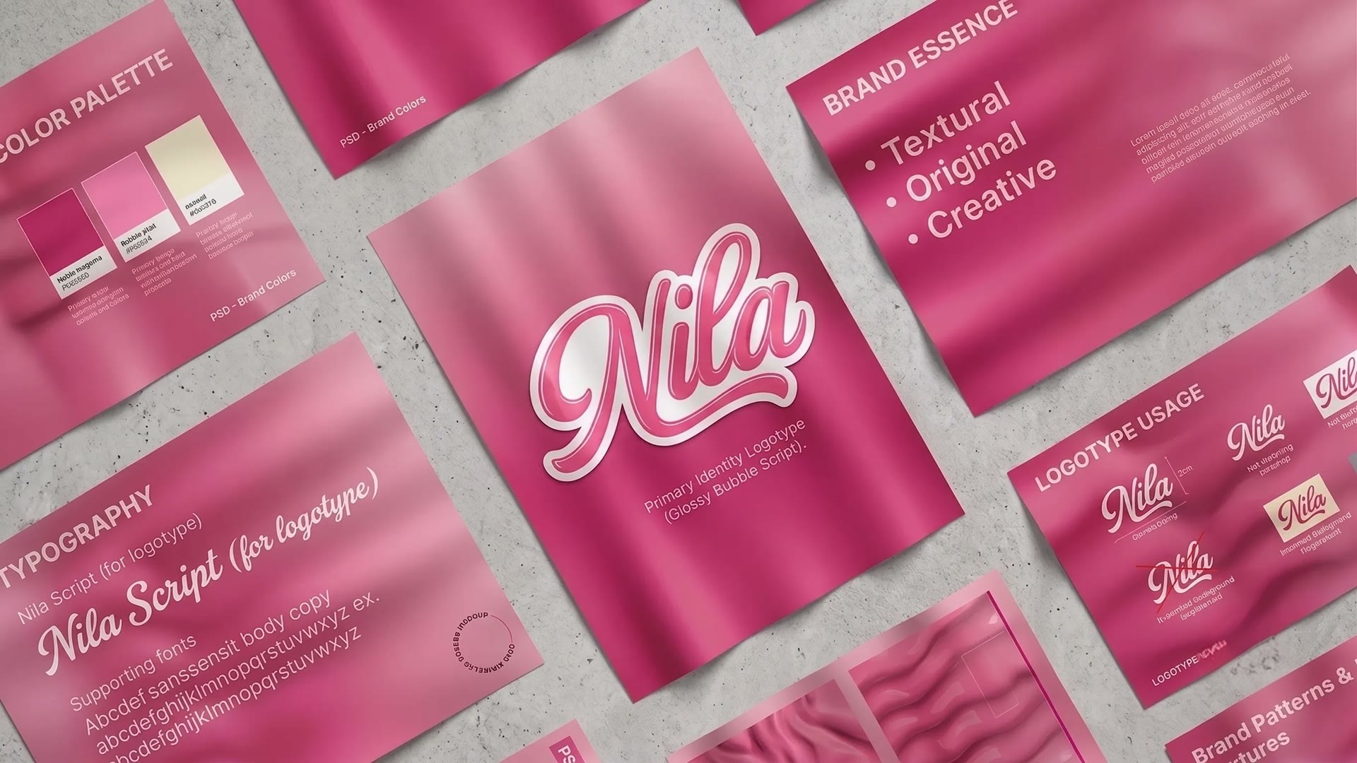
 The result in motion