01
A brand from nothing
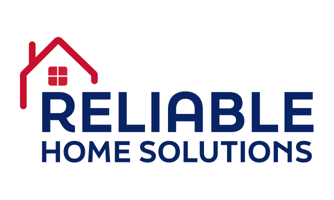
Reliable Home Solutions is a United States mobile and modular home builder, and we were brought in to give the business a brand identity where none existed — and to prepare that identity for expansion into new markets.
Starting from a blank page, we developed the company’s logo and full visual language, drawing on the visual cues of the classic American home so that the mark reads immediately as trustworthy, solid and domestic — the qualities a customer looks for when the product is the place they will live.
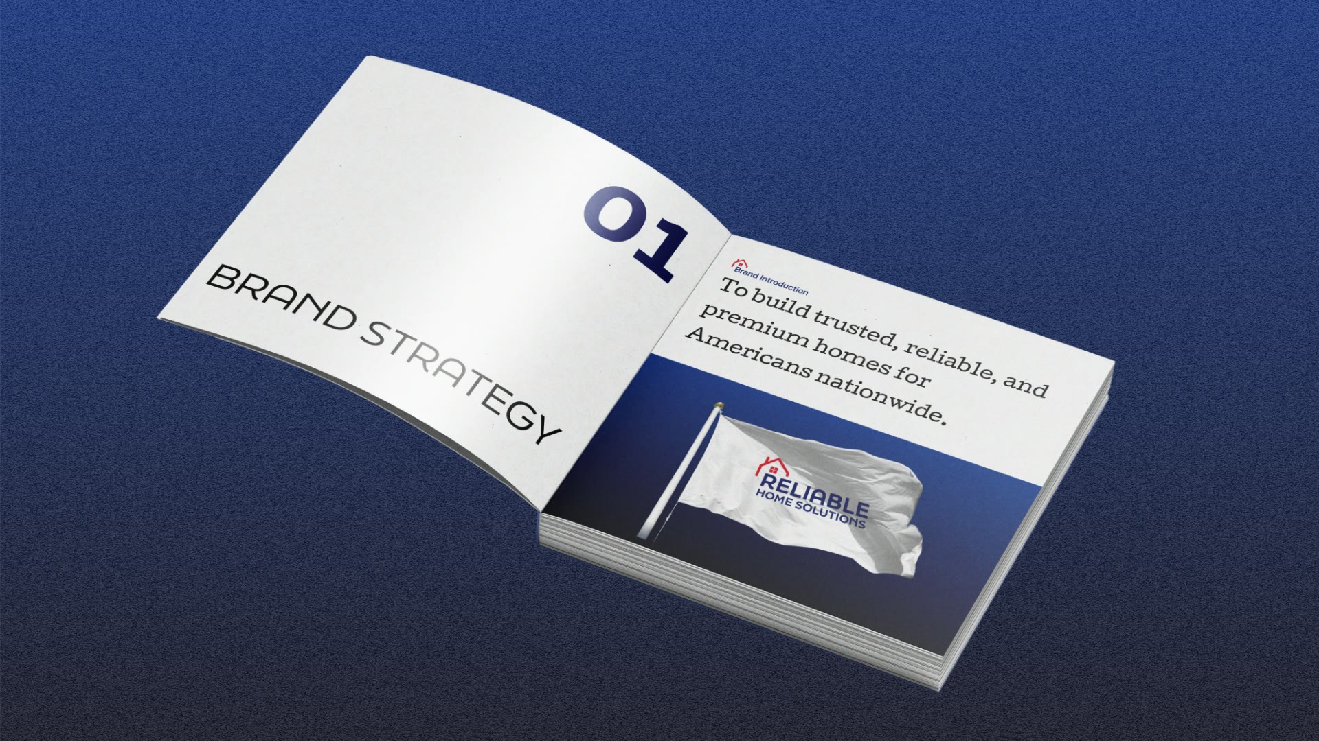
Around that mark we built a complete set of brand guidelines documenting logo construction and clear space, approved variations and misuse, the colour palette, typography hierarchy, imagery direction and application across signage, vehicle branding, digital channels, sales collateral and print.
A durable identity system rather than a one-time logo — an asset that keeps every touchpoint consistent as the company grows across regions.
02
Trust, and room to grow
When the product is the place someone will live, trust is not a nice-to-have — it is the entire proposition. A home builder with no identity has no shorthand for that trust, nothing that signals solidity and dependability before a single conversation happens.
The second constraint was growth. This wasn’t a one-location business; the identity had to hold up as the company moved into new markets and as more people — teams and vendors who were never part of the original design — began producing materials on its behalf.
So the brief had two halves: create a mark that communicates trust instantly, and wrap it in a system robust enough that it stays consistent no matter who applies it or where.
03
A mark built to travel
We grounded the mark in the visual cues of the classic American home, so it reads as trustworthy, solid and domestic at a glance — exactly the reassurance a buyer looks for. The logo and full visual language were developed together as one coherent system.
Then we wrote the system down. The guidelines cover logo construction and clear space, approved variations and misuse, colour, typography hierarchy, imagery direction and application across every touchpoint — written with scale in mind so the brand can be applied correctly by people who were never part of the original design process.
A few principles kept the work honest:
- A logo drawing on the classic American home
- A mark that reads as trustworthy and solid instantly
- A full visual language developed alongside the logo
- Guidelines covering construction, clear space and misuse
- Colour, typography and imagery direction documented
- Application specified across signage, vehicles, digital and print
04
A system, not a logo
The result is a durable identity system rather than a one-time logo. Every element — the mark, the palette, the type, the imagery — is defined and documented, so the brand behaves consistently wherever it appears.
Because the guidelines were written for scale, the system does the work of a brand steward the company doesn’t have to hire. As it expands, teams and vendors can apply the brand correctly from the document alone.
What the client now holds:
- A complete logo and visual language built from scratch
- Comprehensive, scale-ready brand guidelines
- Approved variations and clear misuse rules
- Defined colour palette and typography hierarchy
- Imagery direction and full application specs
- A durable system rather than a single deliverable
05
What the identity changed
A business that started with no visual identity now has a mark that communicates trust on sight and a system that keeps every touchpoint consistent. The brand can present itself credibly from the first sign, wrap or sales sheet a customer encounters.
And because it was engineered for growth, the identity is an asset rather than a constraint:
- A trustworthy, domestic mark where there was none
- A consistent brand across every touchpoint
- Correct application by teams and vendors from day one
- An identity ready for expansion into new markets
- Guidelines that scale without the original designers
- A durable asset rather than a one-time logo
06
Consistent as it scales
Reliable Home Solutions now has what a growing home builder needs most: a mark that earns trust instantly and a system that protects it everywhere. The identity speaks to the reassurance a buyer looks for when choosing where to live.
Written for scale, the guidelines let the brand travel intact — into new regions and into the hands of people who were never in the room when it was designed.
What the client holds is a durable identity system, not a logo they will outgrow — an asset that keeps every touchpoint consistent as the company grows across markets.


 The result in motion